Today, we’re taking a look at the new Five Nights at Freddy’s: Tales from the Pizzaplex Graphic Novel Vol. 1. As I go through it, I’ll share my thoughts on anything interesting I notice, highlighting deviations from the original FNAF short stories, as well as any potential errors in the art or coloring.
The Cover
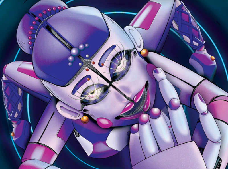
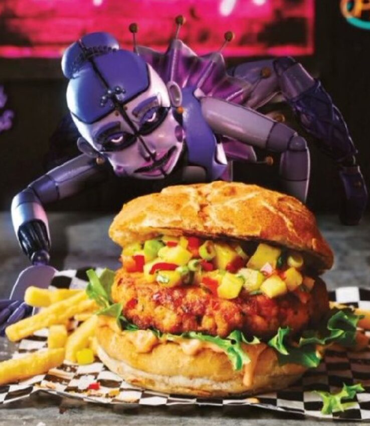
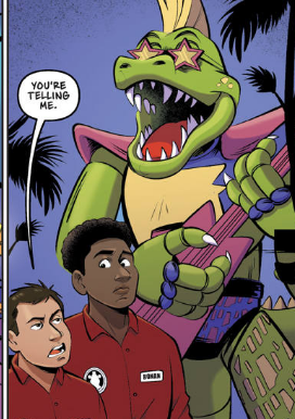
First up there’s the cover which has been through a bunch of different versions since the book was announced, there were very odd decisions made with it. The pose appears to have been referenced from a render utilised in the FNAF cookbook where Ballora crawls spookily towards a giant burger but is still incredibly thoughtfully detailed. There were colouring issues around her boob which were also later fixed.
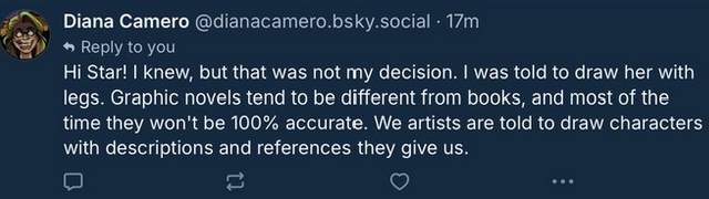
However I’d say right off the bat, the most glaringly strange decision here is the decision to give Ballora legs, when the story itself is very clear that she doesn’t have any.
Ballora was an animatronic designed to look like a ballerina. In the sketches Grady had seen, Ballora “wore” a blue leotard and tutu, but this version of Ballora was just her upper body, which was attached to a robotic mechanism that moved her through the exercise venue.
Cawthon, Scott; Parra, Kelly; Waggener, Andrea. Somniphobia: An AFK Book (Five Nights at Freddy’s: Tales from the Pizzaplex #3) (p. 149). Scholastic Inc.. Kindle Edition.
I can’t really explain the reasoning for this decision, especially since the cover makes Ballora “naked” without her tutu but still leaves her legs. This wasn’t any fault of the artist (Diana Camero) though. As far as I’m aware it was something that was insisted upon, probably by Scholastic.
Honestly I wish they wouldn’t do this stuff, someone high up in the chain at Scholastic is enforcing bizzare decisions that I can’t really comprehend the reasoning on. Anyway, onwards!
FNAF – Under Construction
The first story in the graphic novel is Under Construction. This one is illustrated by Macky Paintuan and coloured by Benjamin Sawyer.
This story in the short story version traumatised me completely. I never expected a FNAF story to have cancer as the central antagonist and threat, and it was completely harrowing to read. This isn’t to say I didn’t enjoy it, it worked well as a horror scenario and has stayed with me ever since, but it was also surprising and I am not sure how they are going to port it at all.
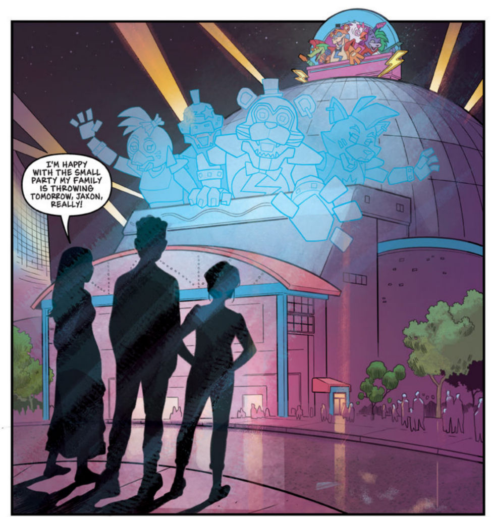
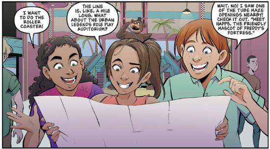
In one of the first panels we get a potential exterior shot of the Pizzaplex, this is fun but also for some reason someone has shaved Roxy’s hair off, leaving her with a mohawk like Monty. I suppose she originally cut his hair like that (as per the Monty’s golf ride) so??
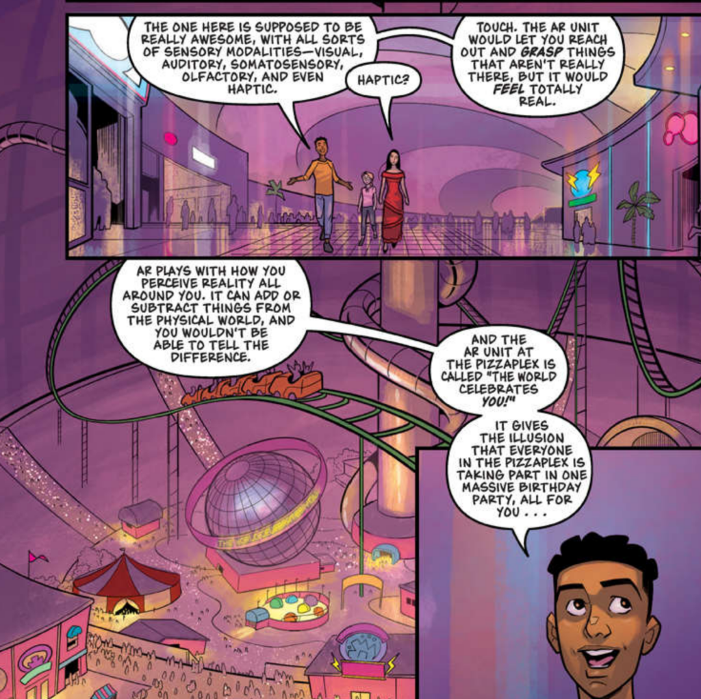
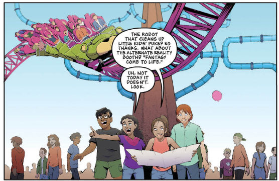
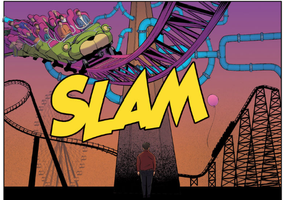
They kids discuss what AR is versus VR which is a conversation they have in the books despite the books really not understanding this distinction at all in how things are implemented. The colouring here is genuinely stunning, I really love the use of light smears to establish the dazzling bright lights of the Pizzaplex. The overview of the book’s atrium with the rollercoaster is nice too, if not completely accurate (the climbing tubes don’t really align with the density we see in HAPPS)
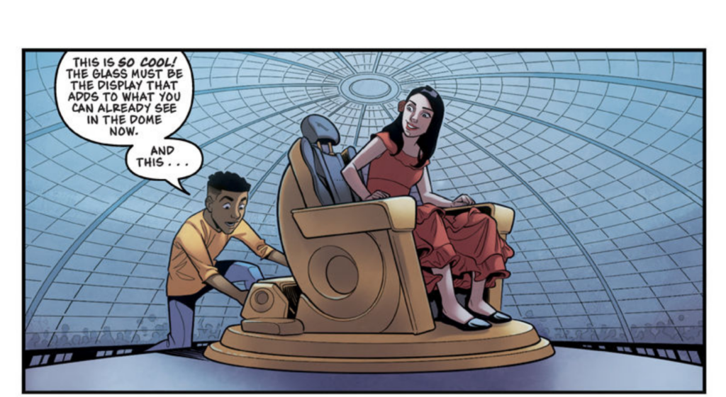
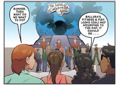
The World Celebrates You (the AR game) is represented here in a very large Epcot-inspired sort of way, reminding me of Spaceship Earth. This is again a bit of a deviation from how the book describes it where it is a little more snowglobe like and the kids can see into it.
The AR unit looked like a giant snow globe … only without the snow. Its base was bright red, and inside the clear, thick glass, a throne-like gold upholstered chair sat in the center of the clear bubble. A flashing neon sign blinked above the spherical glass: The World Celebrates You! Neon stars and streamers surrounded the words.
Cawthon, Scott; Parra, Kelly; Waggener, Andrea. Lally’s Game: An AFK Book (Five Nights at Freddy’s: Tales from the Pizzaplex #1) (p. 141). Scholastic Inc.. Kindle Edition.
They left in the discussion of quantum immortality theory that was in the original story. This one’s got Scott written all over it.
We do see the chair mentioned in the story in this one. The art overall is really good (particularly with the humans) and the colouring work is probably my favourite I’ve seen in the graphic novels to date.
The story till this point is very much in line with the novel, with Maya having her fantastical birthday party within the broken and off limits AR area, heading home again with the fresh memory of the experience. We see her less than stellar birthday party which I think has had its edges hardened a little, in the book she enjoyed it, even if it was small and close with family and then we leap forward a year.
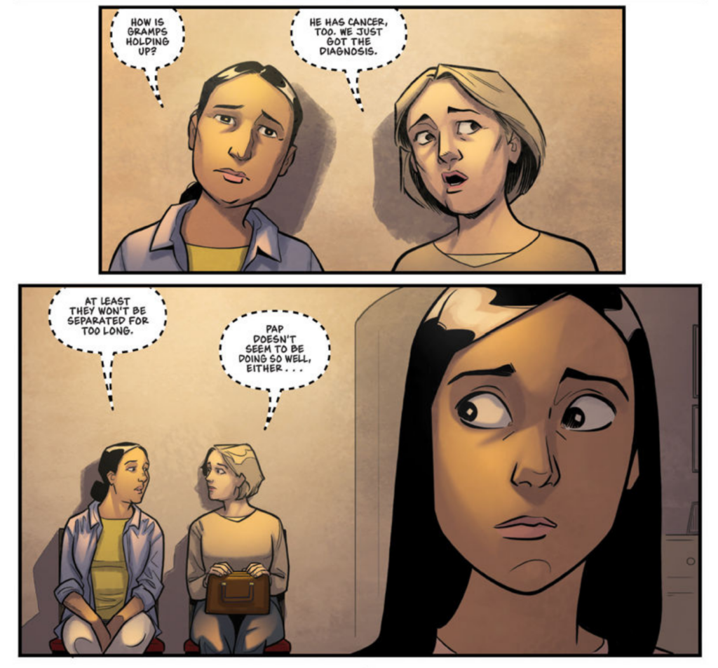
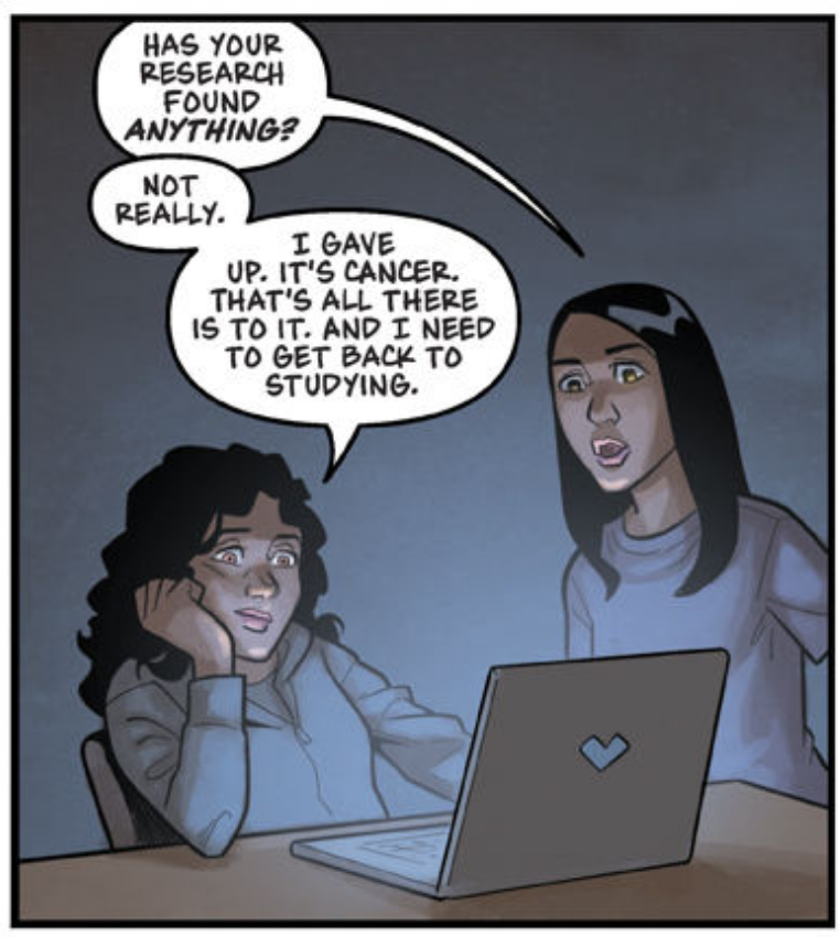
At this point we are dropped into her grandmother’s cancer, with discussion that her gramps has it and pappy.
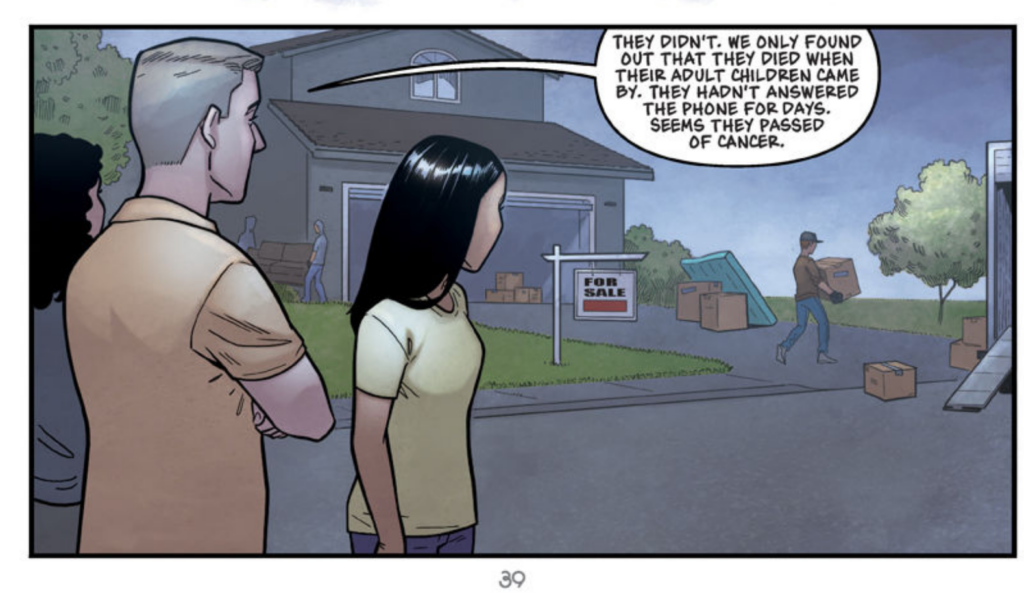
We see that her neighbours also passed. The story condenses a lot of the slow crushing loss that really drives the short story version of this one. Again the colours are beautifully done, really highlighting the mood of the story.
Despite so many people afflicted with cancer the hospitals can’t handle it, Maya’s friends are flippant about it.
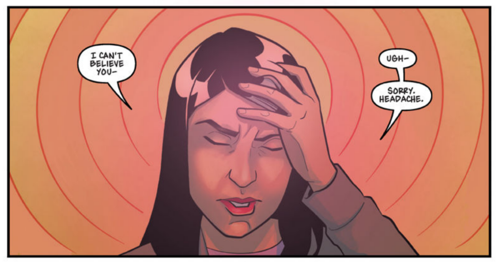
We are reminded several times she is experiencing headaches still, one of the key plot points highlighted in the story too.
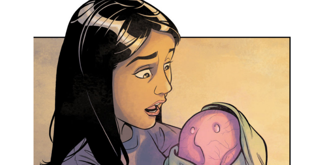
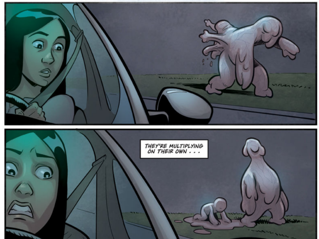
I actually kind of love how they rendered the babies all being terrifying amorphous blob things in this one too, this is a great piece of body horror illustration.
Things continue to escalate with truly vast numbers of people dying in Maya’s world, and everywhere she looks there are strange, misshapen babies. Again this is well illustrated, leaning on the images to carry the story elements they can’t readily convert to the new format.
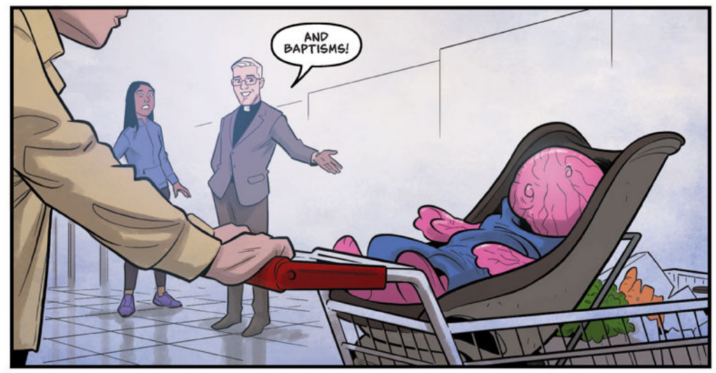
The comic leaps over the terrible deaths that Maya experiences in the form of time skips, lunging forward to a point where almost everyone she knows is dead apart from the shambling blobs. She is down to looking after the remaining children.
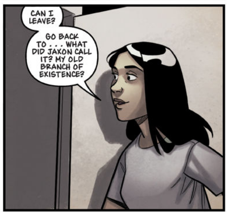
She begins to worry that she never left the Pizzaplex and again they call back to the branch theory of existences.
At this point she realises the blobs are multiplying on their own without any kind of intervention or interaction with humans. I’d say to this point everything is very much in line with the story and how it progressed, even if things are narrowed down and streamlined.
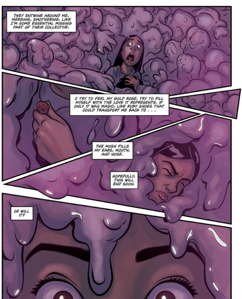
The story ends in the same way as the short story, with Maya consumed by the things, clinging to the love inherent in her necklace, determined that it should all end soon. This is the same sort of cryptic ending we encountered in the short story and though I’m glad they kept this I COULD RANT FOR HOURS ABOUT WHAT I THINK IT MEANS. (I won’t though) we are here just to look at the overall similarities and differences between the stories.
On the whole I’d say this version of the story actually was incredibly successful, the art was strong, the colouring was phenomonal and though we lost a LOT of the visceral and heartfelt impact of loss the novel had, this was entirely expected. Novels take place often within the mind of the main character where we can see their connections and emotions and empathise more strongly. Comics by their nature are more third person observer, we are always drawn back. I think it was completely fine to condense the time periods they did, even if the story was perhaps less strong for it.
Overall I think this story stands better in short story format, but everyone involved did an excellent job on this particular conversion.
FNAF – HAPPS
Next up is HAPPS, the title story of one of the short story collections. This one is illustrated by Coryn MacPherson and coloured by Gonzalo Duarte. This story in the books is one of my favourites due to the strong and heartfelt friendship between the two protagonists, it’s also one of the roughest on me due to the way it ends for both of them. I’m not sure what to expect with this story as it feels like it would be a difficult one to port.
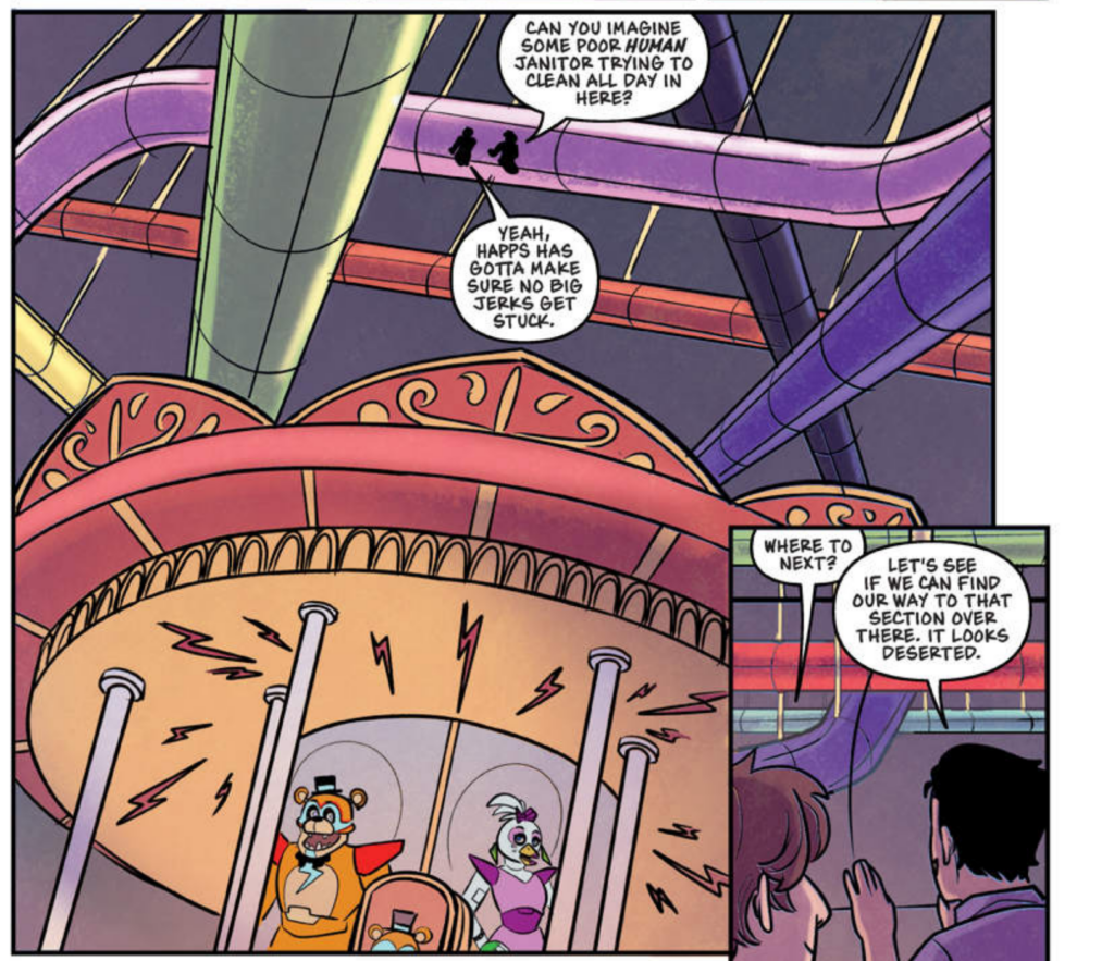
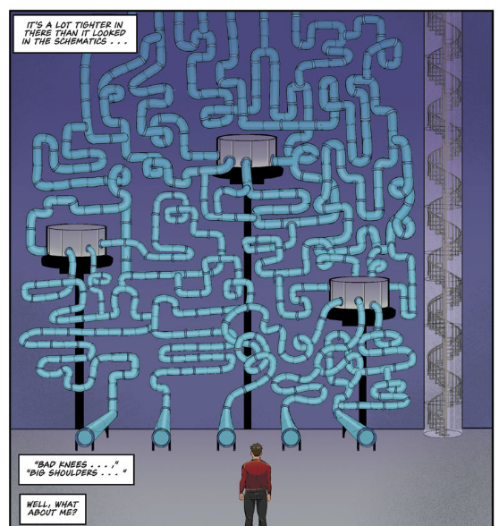
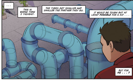
Much of the story takes place within the climbing tubes in the Pizzaplex, and this presents an incredibly monotonous backdrop that doesn’t feel monotonous in the context of a textual work. The tubes are a critical piece of the setting for this one too, almost a character in their own right. This feels like it would place an enormous burden on the artist to meet this expectation. That’s just my throughts before we begin!
Right off the bat I’d say my first impression here is that the artist has a very strong skill for humans and human expressions but that the backgrounds appear to be quite simplistic and not incredibly detailed or strong. This isn’t entirely on the artist’s shoulders though as the colouring decisions appear to also be incredibly generic and stilted. The previous story rendered the Pizzaplex in bright, glorious technicolour. Given similar shapes and scenes to render, the colourist here has not opted to really make anything pop or glow.
When your whole task is colouring, I’d generally expect thoughtful decisions to be part of that task.
Again in the next scene we get a beautiful shot of people in the pizzaplex which a strong colourist as seen in the previous story could have rendered out with the use of colour into a rich scene with implicit scale and depth, they chose instead to simply fill them in with a murky green, making the whole scene feel ghostly and underwater.
It’s not BAD exactly but its not good either.
I find it almost difficult to follow the story here because of the odd colour choices,
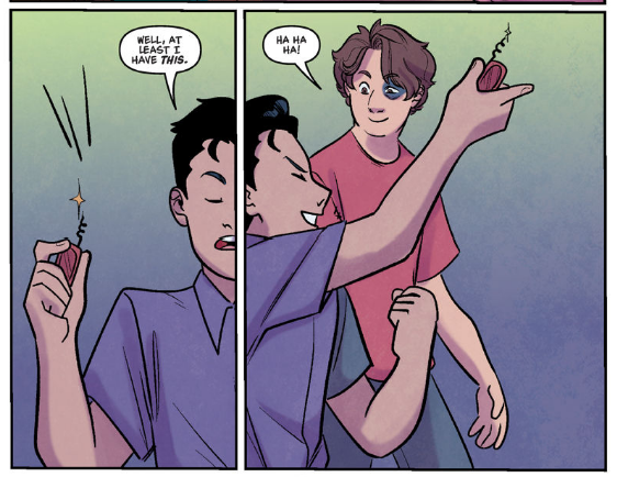
I’m not sure why Jace has a ?? swiss army knife he whips out here either. He didn’t need to pre-establish owning a swiss army knife, in the book he just tries it on the dead end.
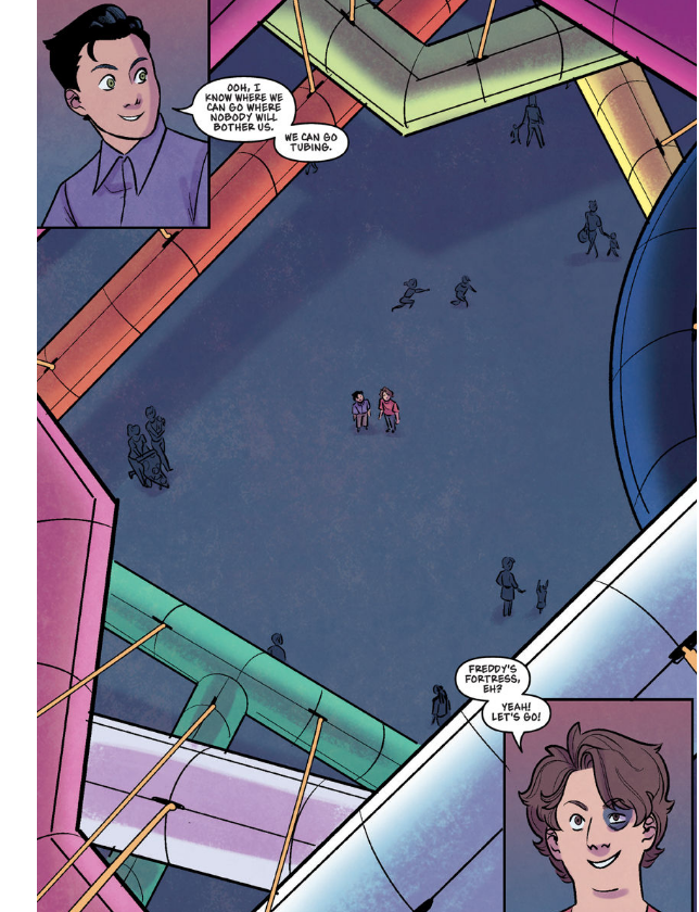
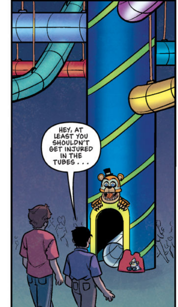
This overhead shot of Freddy’s Fortress should be a grand scene of wonder and anticipation. The book establishes everything in the Pizzeria is bright, glittering and dazzling and Freddy’d Fortress is colourful and garish. These desaturated colour choices are certainly not that.
The tubes in the story are given character of their own and are supposed to evoke almost garish mystery. Either through deadline or simply fulfilling a task as quickly as possible, none of this seems to really have been acheived.
Although the tunnels were formed of transparent plastic that allowed you to see through them, the plastic was tinted in a variety of bright colors, some solid-colored and some multicolored in mind-blowing patterns like stripes or polka dots or illusions similar to the pinwheel shapes at the entrance. A few tunnels were just plain clear plastic. Some were so black they were nearly opaque.
Cawthon, Scott; Cooper, Elley; Waggener, Andrea. HAPPS: An AFK Book (Five Nights at Freddy’s: Tales from the Pizzaplex #2) (p. 62). Scholastic Inc.. Kindle Edition.
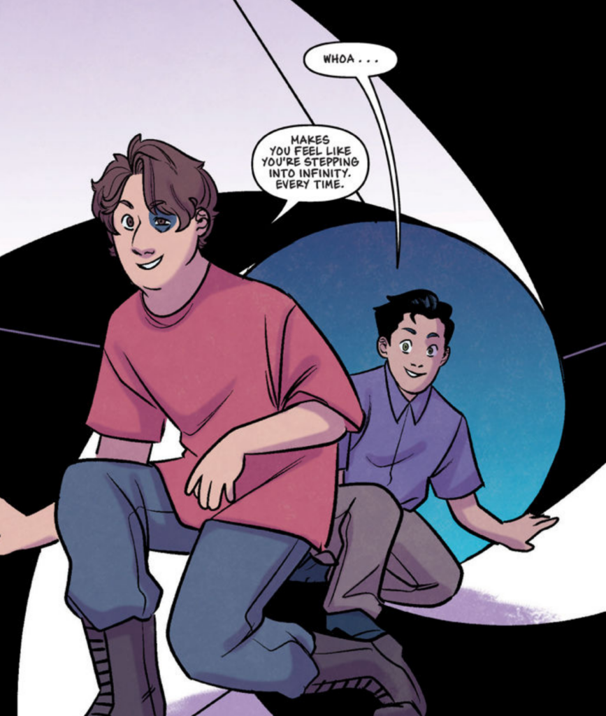
The entrance is certainly not the one described in the books either.
Freddy’s Fortress was long, narrow, and disorienting. Painted in a black-and-white pinwheel illusion pattern, the entrance made you feel like you were stepping into infinity. You felt like you were leaving the real world behind, being lured into a topsy-turvy realm that would trap you forever.
Cawthon, Scott; Cooper, Elley; Waggener, Andrea. HAPPS: An AFK Book (Five Nights at Freddy’s: Tales from the Pizzaplex #2) (p. 59). Scholastic Inc.. Kindle Edition.
They kind of try and interpret this through the art one time but abandon it immediately. Without the context of the text, it seems completely out of place and a little bit absurd. Why is it like stepping into infinity? In the text its clear its because of the pattern on the entrance which is not actually a pipe.
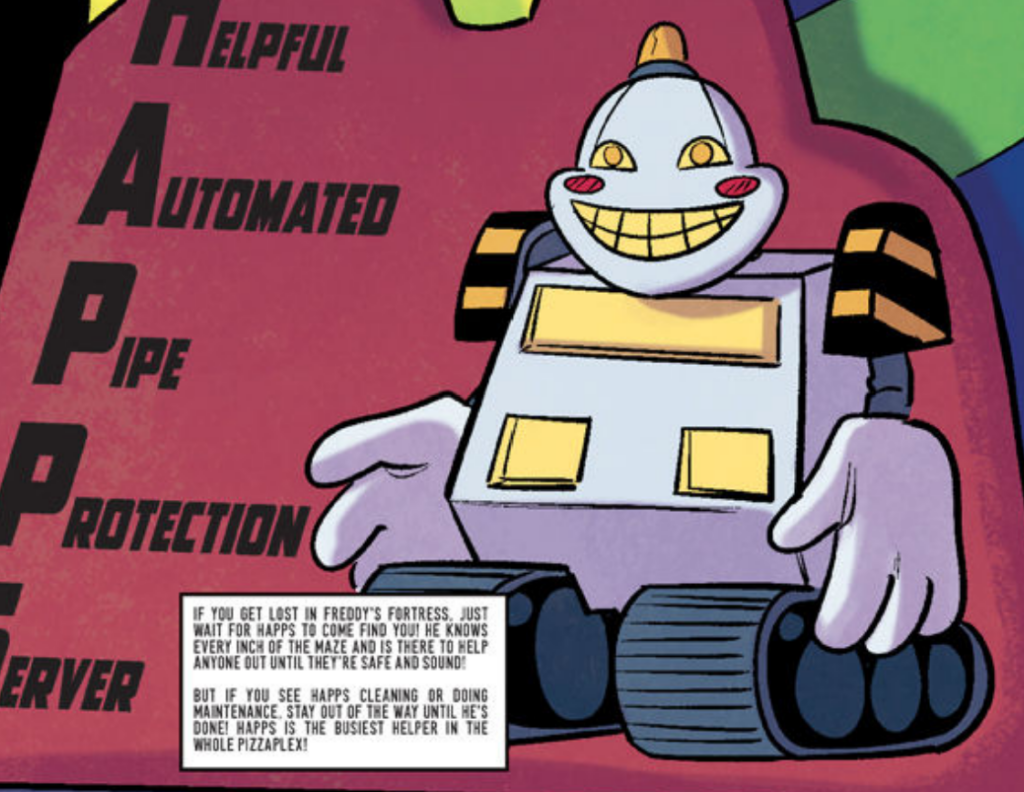
The text on the HAPPS sign is so small it is almost impossible to read on the page without zooming in.
The colours continue to be drab and uninspired, even in the more interesting shots of items in the Pizzaplex below the climbing tubes and the story is very lacking in character development with the characters mostly providing exposition for why HAPPS exists (these tubes would get dirty without him!)
They discuss the dead ends and the fact they are a bit hungry, but not a lot else. We see the scene where they surprise some kids, but without the context of the character perspectives and personalities it seems like an arbitrary and mean things to do, and the kids themselves aren’t fleshed out enough to remain enduring impressions.
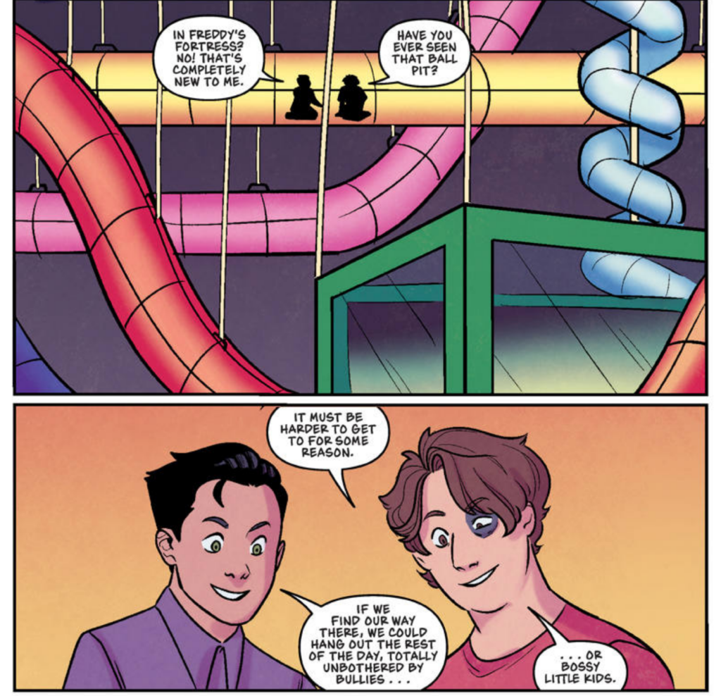
In a bizzare decision they spot a ball pit out of the climbing tubes and decide to try and get to it for no reason other than its hard to get to. This is a kind of bizzare decision to take and doesn’t have the same ominous hint that the place they go to in the books does.
In the book they fall into a few different ball pits as part of the winding fortress but the really interesting area is a seperate area of the maze itself, close but inaccessible –
Occasionally, though, a break in the mirroring gave Aiden a glimpse of a huge knotted network of pipes that appeared to be completely empty of kids.
Cawthon, Scott; Cooper, Elley; Waggener, Andrea. HAPPS: An AFK Book (Five Nights at Freddy’s: Tales from the Pizzaplex #2) (p. 74). Scholastic Inc.. Kindle Edition.
They remark on how it doesn’t appear to be blocked off the same way as the rest of the pipes either.
Aiden scooted up next to Jace and put his hands against the smoky plastic. He peered through it. He could see the vague outlines of a convoluted matrix of pipes that was completely empty of kids. “I wonder why this area is blocked off.” “If it was for maintenance, wouldn’t there be a mirror like the others?” Jace asked.
Cawthon, Scott; Cooper, Elley; Waggener, Andrea. HAPPS: An AFK Book (Five Nights at Freddy’s: Tales from the Pizzaplex #2) (p. 76). Scholastic Inc.. Kindle Edition.
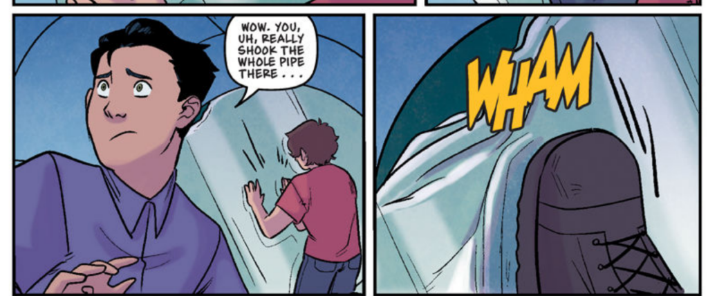
As in the original story they kick their way through a partition.
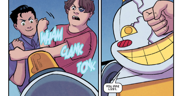
However in the original story, when HAPPS comes to bother the two boys, we understand the underlying sense of helplessness that Aiden feels in his life and can understand why he kicks back at HAPPS bossing him around. His violent outburst feels rooted in his character. In the graphic novel it is almost absurd and hilarious when he punches HAPPS and despite knowing the story just made me laugh.
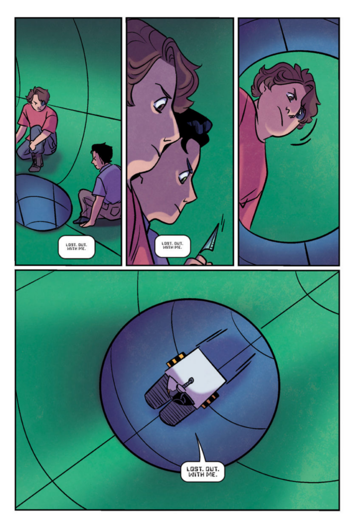
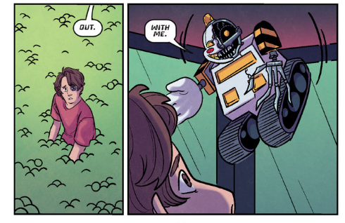
In this version the tube falls into the ball pit and they realise they are trapped, only for HAPPS to show up again from the pit itself. This was never really the framing in the story and makes this more reminicent of into the pit (I have had so much into the pit, please no more)
They are chased by HAPPS but again there isn’t much by way of stakes. The artist does a great job with the two characters but the script gives them nothing to work with in terms of the characters speaking to one another about anything other than exactly what is required to propel the plot forward. The personalities of the characters in this character framing story are gutted entirely.
The colouring is miserable, a murky mire of desaturated greens and blues in a world that does not make much sense without the context of colours to make it readable to the viewer.
When Aiden’s leg gets hurt the gore is non-existant and does not seem to have the same repercussions. They have Jace’s death take place sillouhetted out, with none of the gory horror of the original story, with Aiden forced to release his dying friend and flee.
In the original story, Aiden runs from HAPPS as HAPPS destroys the tubes, with the tubes becoming sealed off as they sustain damage, he has less and less space to flee and can hear HAPPS behind him. There’s a sense of deep futility and as he looks out he realises he is essentially gone already.
As Aiden crawled through the pipe, he couldn’t help but see the kids beyond the pipe’s plastic walls, and he realized he had gotten his wish. He was invisible.
Cawthon, Scott; Cooper, Elley; Waggener, Andrea. HAPPS: An AFK Book (Five Nights at Freddy’s: Tales from the Pizzaplex #2) (p. 117). Scholastic Inc.. Kindle Edition.
The graphic novel chooses to end things in the most absurd and silly way imaginable, with the impression that HAPPS jumped 20 foot into a ball pit.
Yeah I didn’t like this one. The artist did the characters really well, but was given nothing for them to latch onto, the story wasn’t clear, a lot of the decisions were weird.
The colouring was honestly kind of the worst. Did not like the colouring at all. Very phoned in, some decent shading choices and textures but the colours were not appropriate either to the emotions or the locations within the story.
FNAF – Cleithrophobia
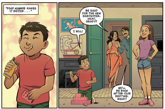
Next up is Cleithrophobia, this story was illustrated by Diana Camero and coloured by Judy Lai. Diana is a favourite of mine as she illustrated the second and third graphic novels for the trilogy. However it sounds like she was treated quite poorly by Scholastic and has since decided not to continue working for the series. This is a real shame, I enjoy her work. She has a keen attention to detail and I do feel that if there are inconsistencies to be found in this story, they will be at the strange behest of whoever is making the decisions.
The first page does not at all fill me with confidence in the colouring. The illustrations are lovely but the colouring choices border on the unhinged.
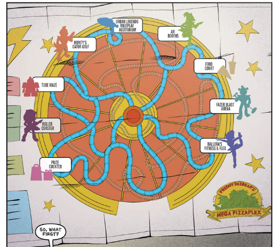
The Freddy’s map, rather than being bright and cheerful is illustrated in shades of orange and yellow, with the rollercoaster basically indiscernabile from anything else.
The panel introducing us to the introductory characters – much like the previous story – is coloured in wishy washy desaturated colours, not reflective of the excitement or bright enthusiasm of the Pizzaplex, which is what these panels were meant to do.
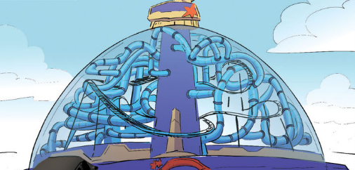
Diana did a brilliant shot of the rollercoaster rushing over their heads but this shot was coloured so strangely that we are left thinking there is sky overhead rather than the arching dome of the Pizzaplex, with no nuance or colour given to the climbing tubes.
The bad colouring choices here turn a great, dynamic establishing shot into a baffling nightmare where the climbing tubes look like hamster pipes and fast freddy which is described throughout the stories is GREEN for some reason??? Freddy’s ICONIC GREEN PAINT.
Ok I’m mad already.
Again though Diana shows attention to the source material in her illustration. The world celebrates you looks like the snowglobe it is supposed to here, more attentively than in the story we had based around it.
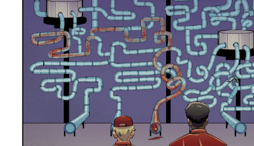
Even the depiction of the climbing tubes in the overall shot we see, despite once again being done dirty by the colouring is SO much closer and more accurate to the nest of climbing tubes we see described in HAPPS.
The interior shots could have been a lot of fun, I really love Grady and his expressions, but once again the colourist just did not give a damn about FNAF and its evident when they draw characters they could have googled in about five seconds.
Blonde Monty smacks of contempt for the effort the artist made drawing him. God, the uniforms even have the little Freddy logo from Security Breach on them in a thoughtful little touch. Diana did her homework and it shows in so much of this.
The story is conveyed well for the most part with Grady left behind.
There appears to be some kind of weird editorial or colouring choice made in this panel where I think perhaps the intention was to have everything cast in sillouhette as people leave
But instead there are the same people riding Fast Freddy in the same colours as earlier after hours? In an empty pizzaplex? This confuses the hell out of the narrative which is supposed to be informing us Grady’s alone, he even worries about being trapped! Could the colourist not be bothered recolouring a scene? What happened here.
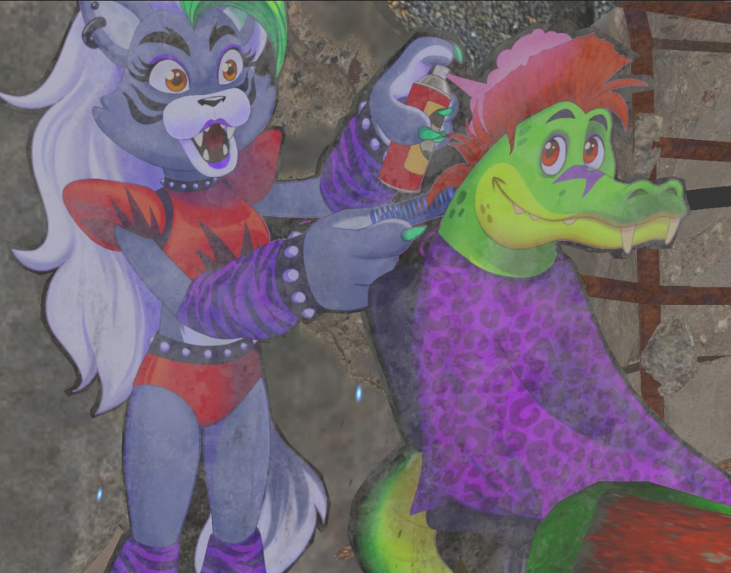
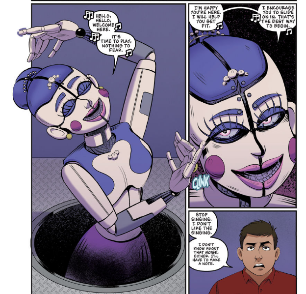
Ballora’s fitness and flex is BEAUTIFULLY conveyed by Diana’s illustration, showing the different stopping points on the way down without even really needing to explain how it works at all. Again, the colours are phoned in, even after hours, the Pizzaplex would have colours.
It’s always “generic hamster maze” blue without fail. I wish I could have coloured this at this point, I’m so angry.
We get some actual colour work in the flashback for some reason in contrast to the Pizzaplex.
I’m glad in this story we do actually retain Grady’s backstory, we get to understand why he doesn’t like the tubes, if this had been cut out the story would have been less of a character study, and I’m glad we see it. They left out his arm being stuck though, but I suppose that would have been difficult to illustrate clearly so it doesn’t bug me much.
Again the tubes are just drawn so pleasingly.
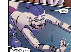
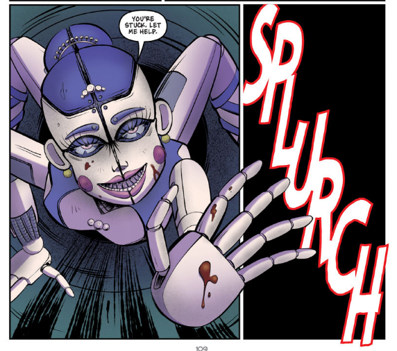
Also we can pretty much tell that when Ballora was drawn that she was drawn correctly in line with her book description. It feels like someone later was like “add legs” and the illustration had to be changed. The art is really nice and incredibly thoughtful and I guess at least the colourist looked at a reference of Ballora this time.
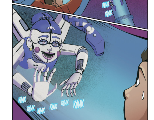
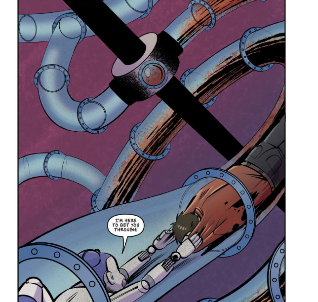
Grady’s plight in the tubes is well conveyed, along with the awkwardness of moving through them. Its a difficult challenge to convey this, as we as viewers have to see through the tubes to see what Grady is doing.
When Ballora does show up, it really does feel like the legs were drawn on afterwards in response to an edict from above.
This one is genuinely so well drawn, I love it. I just wish the calibre of art had been matched by the calibre of colouring.
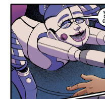
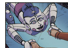
Everything is aligned well with the story, with Grady getting stuck and requesting help from Ballora, only to find that she is too strong and pulls him out too hard, much to his distress. Ballora’s expressions are really entertaining and give her a strong character too, which not a lot of people can do.
I’m still laughing at all the shots where Balloras legs feel like someone drew them in like FINE THERES A LEG ARE YOU HAPPY NOW
They changed the absolute horror of Grady’s fate, not by having him be dragged through increasingly thinner tubes by Ballora as his bones unhinge and organs rupture (which was insanely brutal originally) but simply have her grab his head.
Honestly this was a fine compromise and still gave us truly horrific scenes, just less intensely.
As his coworkers come back they are met with this scene which I think is beautifully impactful while sidestepping the truly horrific nature of the gore described in the short story.
His friends negotiate the same dillemma and leave the same was as in the original story, and I think the ending we are given is equally impactful as the story, with the potent image of Ballora at the very end.
I thought this one was great, other than the colouring. But even in black and white I’d have been all about this story. I think they interpreted this one really well, and I’d say it even improves the story itself in some ways. The story could be quite long winded in the parts where Grady is navigating the tube maze, but the graphic novel streamlined this and focused more on what mattered.
Other than a few odd scenes and the hilarious legs which DID NOT NEED TO BE THERE. (I’d like to shake the person who clearly insisted upon them) I think this one was excellent.
And if anything it makes me want to try and re-colour some of these shots myself because my god they were done so dirty.
Conclusion
So this graphic novel was actually ok! There haven’t been a lot of them I can say that for, either the artists were TERRIBLE (like in some of the very early fazbears frights) or the colourists were atrocious. Here the colourists even when not good were PASSABLE at their craft. But this one had some genuinely nice artists.
I think overall I just wish these were given the same time, finance, love and care that the books are given. The books are some of the first things kids will read, and these comics if they are sold at book fairs (and go on the BESTSELLERS LIST ALMOST EVERY SINGLE TIME WITHOUT FAIL) should be given adequate love and care. I know they can half ass it and still collect the same pay cheque, but when they are treated with love you can tell.
If I could have anything, it would Scott more involved with these or a keen guiding hand treating them the way beloved superheroes are. These stories were a step in the right direction, but it still feels like some clunky managerial choices are being made and colourists are not being chosen with a discerning eye.
But yeah, at least I could finish it. I can’t normally even get through these I find them so much of a step down from the books. But in some of these actually I think there was nice scene work and attention to the Pizzaplex. We’ll see where we go from here.
And I’ll always be pretty sad we are losing Diana as an artist, I could feel the love in that short story, but also the struggle.
Who are we?
The FNAF Network is a news and theory site run by Cathures Labs, (Cathures and Shockburnt.) It a one stop shop for FNAF information without needing to deal with a social network at all! A completely unofficial fan site for Five Nights at Freddy's.